
interaction design • information visualization • Python • d3.js • algorithmic transparency
The Problem
In online dating, there is a high prevalence of racial prejudices. Algorithms behind the scenes are often implemented on behalf of users without users understanding how their profile preference settings impact their pool of potential dates.
The Solution
How Many Fish?, a visualization tool, allows OkCupid users to play with their profile preference settings to explore the effects on their pool of potential matches. The goal is to encourage users of online dating services to consider impacts of their preference settings.
Play with the visualization here
Design Overview
We began by reviewing articles and interviewing users of OkCupid about racial biases and lack of algorithmic transparency in online dating. We then looked into the detailed workings of OkCupid's matching algorithm, which is based on preference questions each user answers (thankfully the algorithm was publicly available).
In thinking about how to visualize the pool of potential matches, we were drawn to circular visualizations given it resembles a 'pool' of people containing all of the 'fish in the sea'.
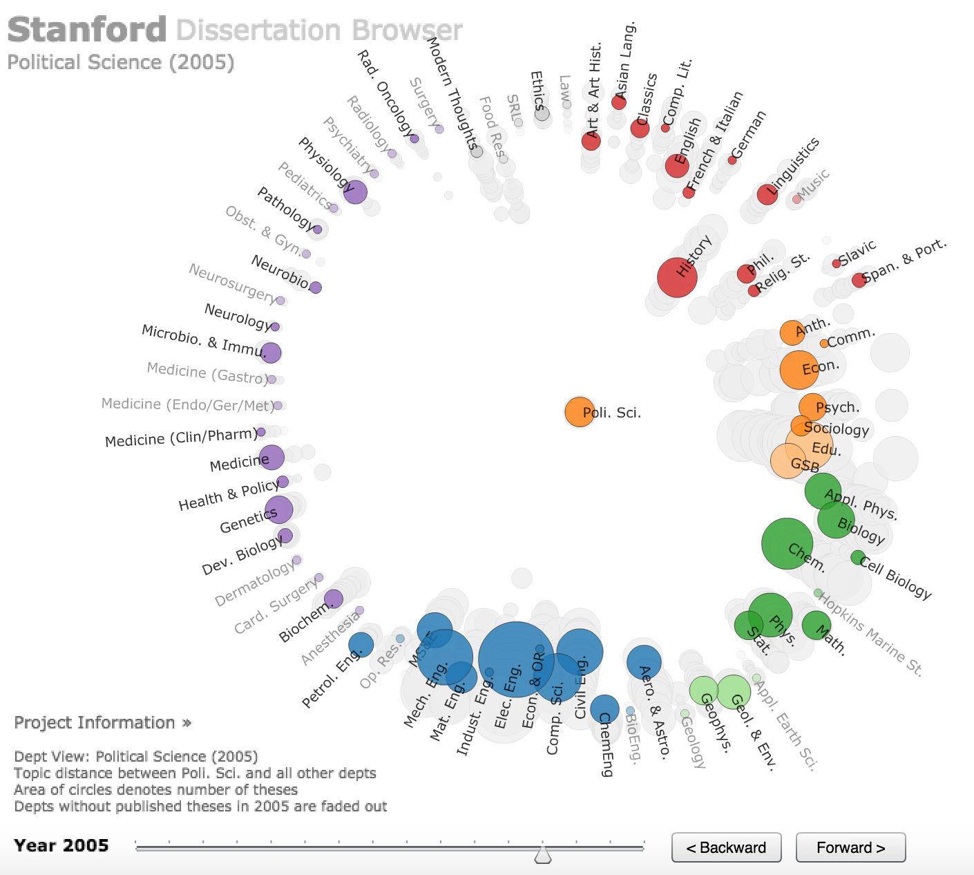
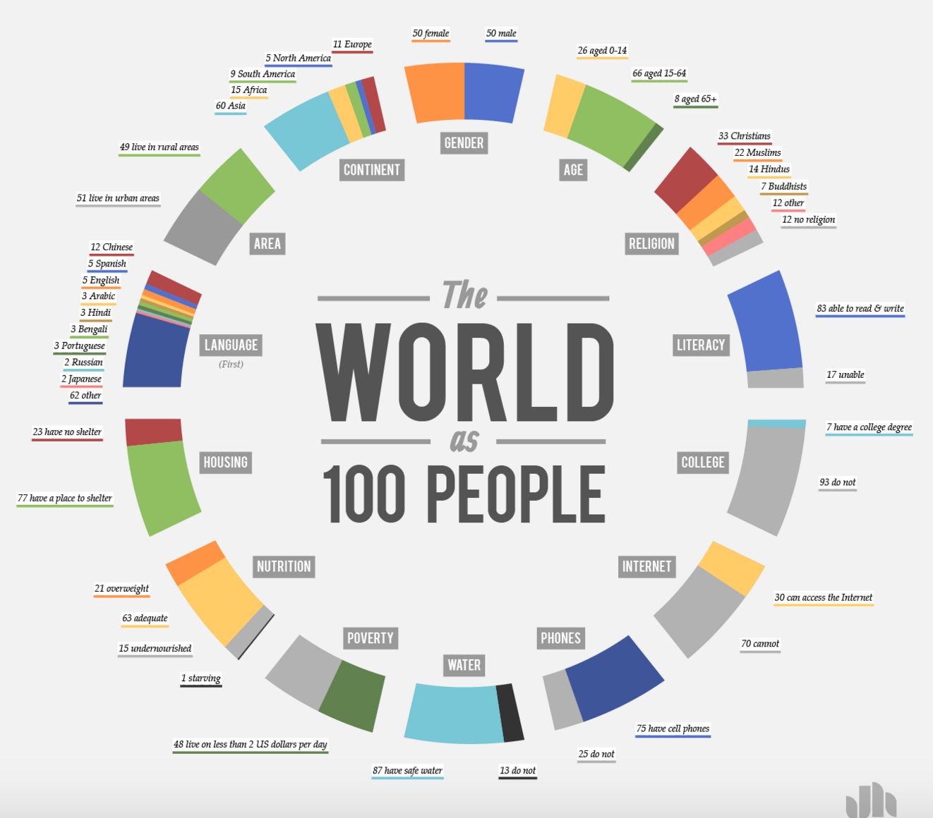
We drew inspiration from existing circular data visualizations including Stanford's NLP group (left) and Jack Hagley's The World as 100 People Visualization (right):
With the circular inspiration, we then sketched out how to tie together the user answering OkCupid dating preference questions and the pool of potential matches changing. Plus, color highlighting pertaining to demographic data.
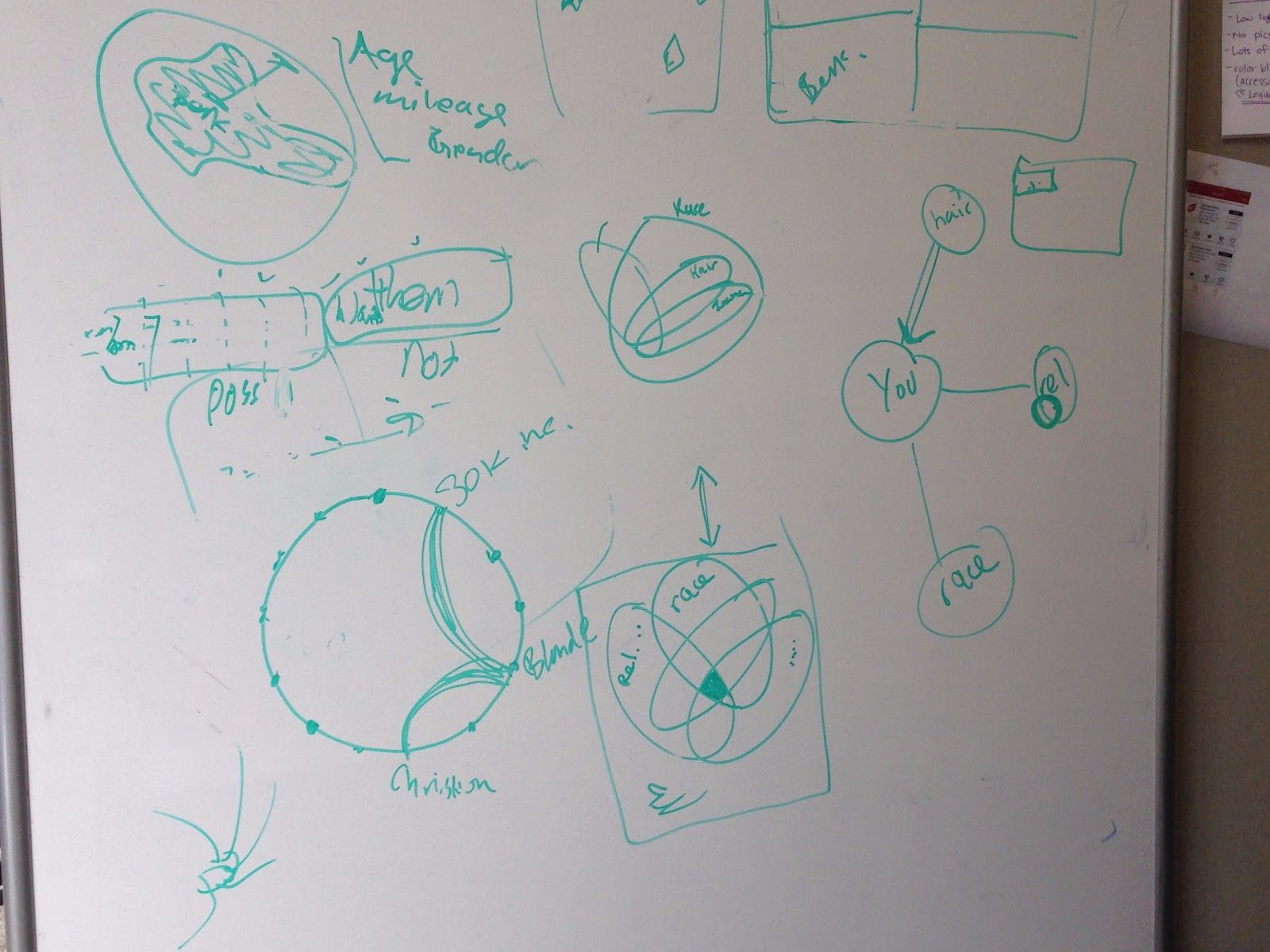
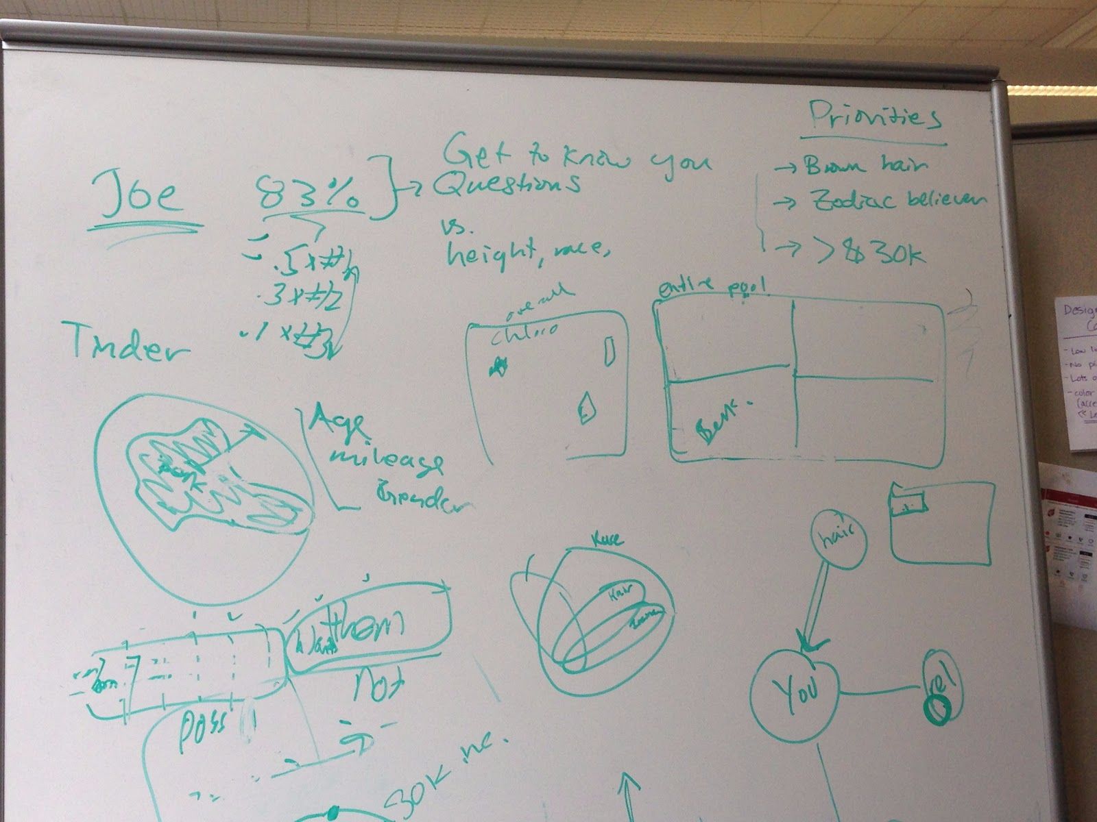
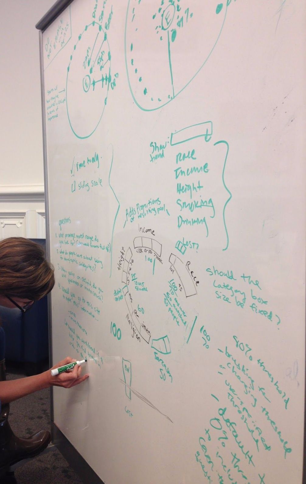
(Sketches primarily by me)
The final visualization included a 'pool' of potential matches. The center of the circle represents you, the viewer. Each dot represents a potential match on OkCupid, and their distance away from you (i.e. radius) represents how compatible they are as measured by compatibility percentage. Someone on the outer edge of the circle has low compatibility (ex: 10% compatibility) and someone closer to the middle of the circle has high compatibility (ex: 90% compatibility).
How compatible a potential match is to you changes depending on how you rank the importance of the OkCupid questions (upper right corner of visualization). As you answer each question, the pool of potential matches changes.
You also have the option of interacting with the distribution of certain demographic data across your pool of matches. When you click on Education, Ethnicity, Height, or Body Type, the dots color accordingly. The objective being to showcase how uncorrelated demographic information and compatibility metrics are from each other.
Below is a screen shot of the final visualization. You can also interact with the visualization.
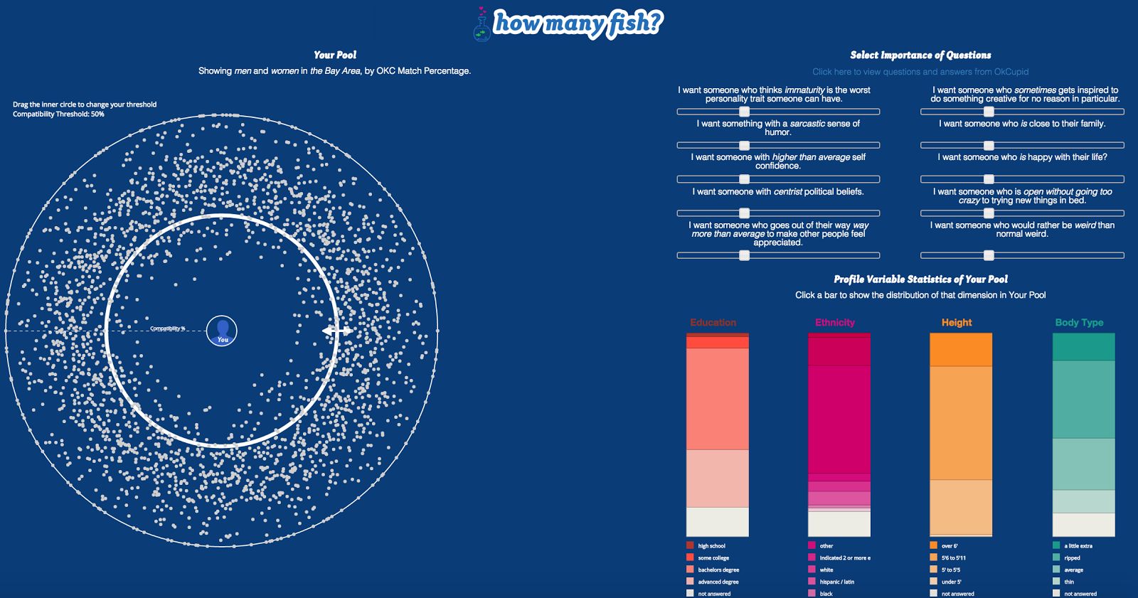
(Built using d3.js; I implemented the colored bars)
Full Report
For more details on user research, design details, development, and future direction see the full report. Github for code.
Project team members: Max Curran • Paul Glenn • Emily Witt