critical design • interaction design • film editing • making
The Problem
Many industries are being automated today from transportation with Uber and Lyft to food with Eatsa. With this evolution come concerns of de-humanization of human service labor as a direct result of hiding workers behind machines and interfaces to cater to the comfort and convenience of consumers.
The Solution
(Film editing by me)
Uberick is a critical design piece re-imagining Uber-esque ride sharing services as the primary mode of transportation in the 1920s. The Uber model and app is applied to the traditional rickshaw and the personalization aspects are taken to an extreme by allowing riders to choose their car brand, a theme song, their driver’s attire, and the manner in which the driver greets them. Rickshaws, a visually salient representation of class differences between the puller and rider and of the service industry more generally, are juxtaposed against the sleek Uber app and business model that is focused on automation, efficiency, and personalization. The goal of this juxtaposition is to call into question concerns of de-humanization of human service labor.
Design Overview
Starting with our project prompt of human forms of transportation, we were immediately drawn to rickshaws as they so saliently show de-humanization of the puller. We then needed a design that would provoke questions and discussion around de-humanization of service workers.
We considered going with an animal theme where the puller of the rickshaw would be equated to an animal. We considered having animal sounds on the rickshaw that would sound when the rickshaw was being pulled. We considered animal feeders on the rickshaw to ‘tip’ the puller.
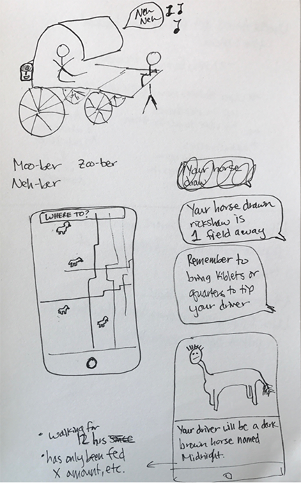
(Sketch by me)
We were also drawing the comparison of rickshaws to car ride services such as Uber and Lyft, where some drivers experience long hours, low pay, and verbally abusive riders expecting drivers to figure out how to get around traffic.
We ultimately went with the extreme personalization of the rickshaw with car brand logos, theme songs, driver attire, and facial greeting because the animal direction we feared would embarrass the driver. Throughout this project we were trying to be very cognizant that both rickshaw and Uber drivers make their livelihood providing these services.
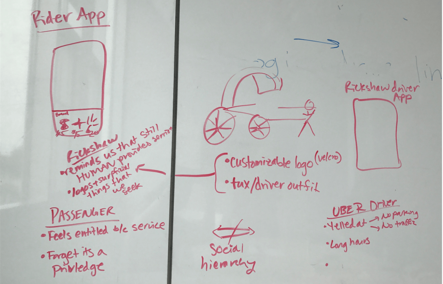
(Sketch by me)
I focused on designing the mobile app and logo. The logo was a icon of a rickshaw with the Uber square placed inside the rickshaw wheel.
(Design by me)
We had both a rider and a driver app, mimicking the Uber and Lyft model. Here are screenshots of the rider app.
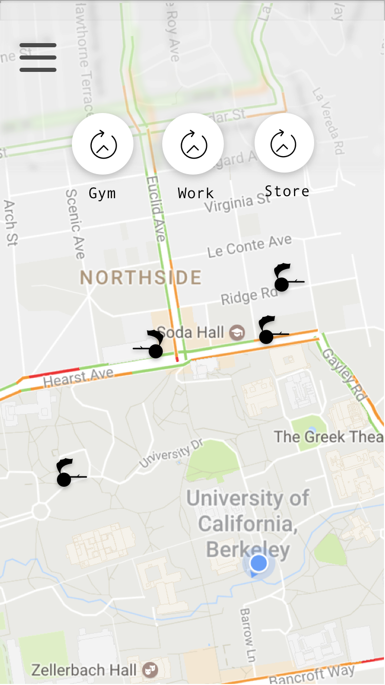
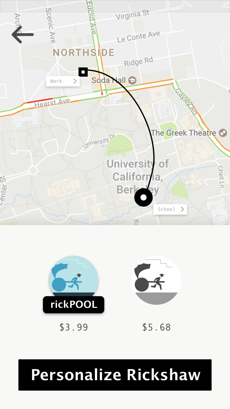
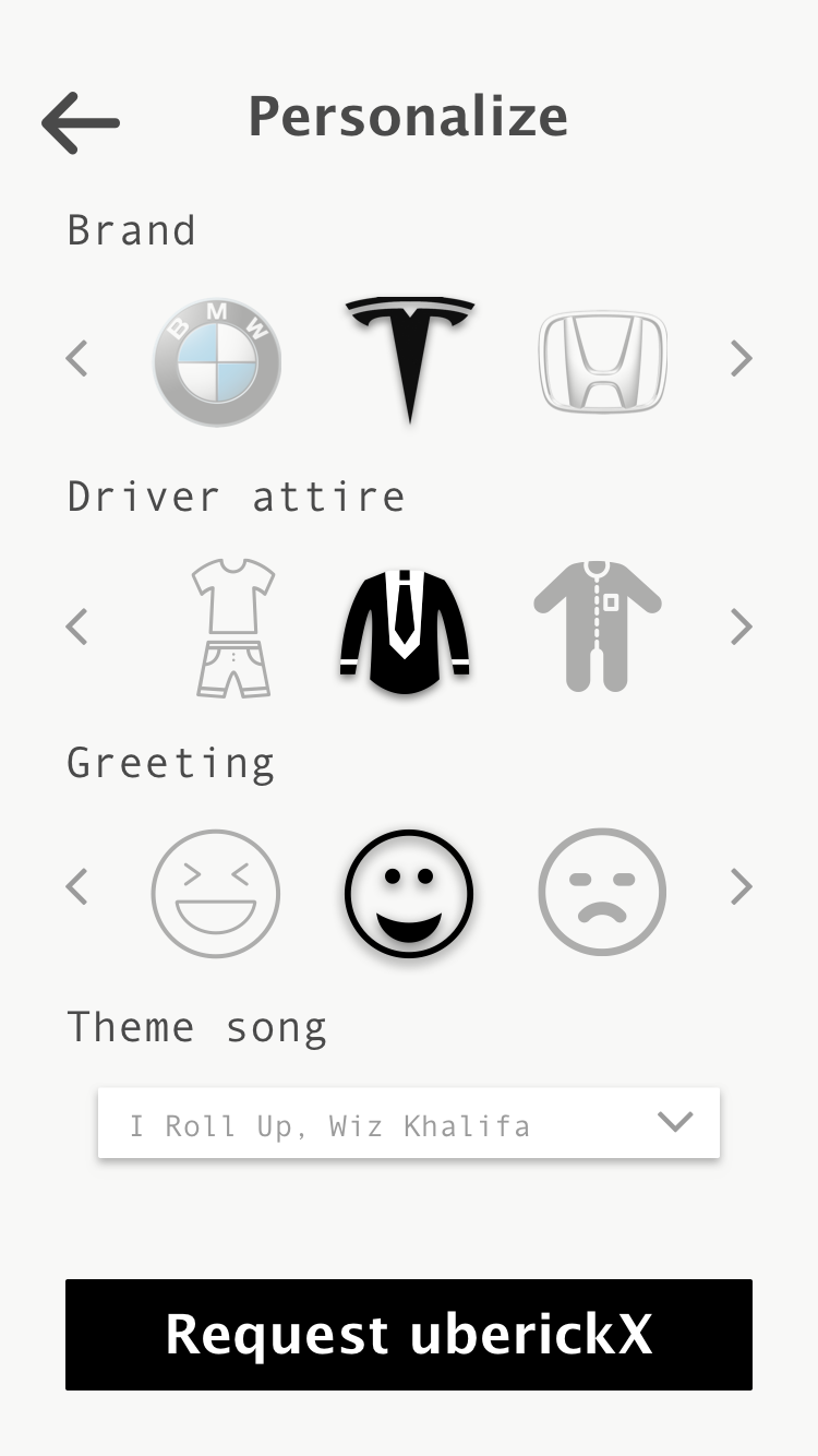
(Designs by me)
Full Report
For more details on design iterations and fabrication, see the full report.
Project team members: Michelle Chang • Chris Bui • Ricky Lee